 |
Version: 2.9.4 |
#include </home/zeitlin/src/wx/github/interface/wx/radiobut.h>
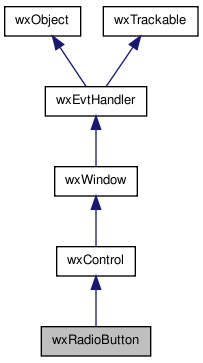
 Inheritance diagram for wxRadioButton:
A radio button item is a button which usually denotes one of several mutually exclusive options.
It has a text label next to a (usually) round button.
You can create a group of mutually-exclusive radio buttons by specifying wxRB_GROUP for the first in the group. The group ends when another radio button group is created, or there are no more radio buttons.
This class supports the following styles:
The following event handler macros redirect the events to member function handlers 'func' with prototypes like:
Event macros for events emitted by this class:
wxEVT_COMMAND_RADIOBUTTON_SELECTED event, when the radiobutton is clicked.  | 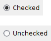 |  |
| wxMSW appearance | wxGTK appearance | wxMac appearance |
Public Member Functions | |
| wxRadioButton () | |
| Default constructor. | |
| wxRadioButton (wxWindow *parent, wxWindowID id, const wxString &label, const wxPoint &pos=wxDefaultPosition, const wxSize &size=wxDefaultSize, long style=0, const wxValidator &validator=wxDefaultValidator, const wxString &name=wxRadioButtonNameStr) | |
| Constructor, creating and showing a radio button. | |
| virtual | ~wxRadioButton () |
| Destructor, destroying the radio button item. | |
| bool | Create (wxWindow *parent, wxWindowID id, const wxString &label, const wxPoint &pos=wxDefaultPosition, const wxSize &size=wxDefaultSize, long style=0, const wxValidator &validator=wxDefaultValidator, const wxString &name=wxRadioButtonNameStr) |
| Creates the choice for two-step construction. | |
| virtual bool | GetValue () const |
| Returns true if the radio button is checked, false otherwise. | |
| virtual void | SetValue (bool value) |
| Sets the radio button to checked or unchecked status. | |
| wxRadioButton::wxRadioButton | ( | ) |
Default constructor.
| wxRadioButton::wxRadioButton | ( | wxWindow * | parent, |
| wxWindowID | id, | ||
| const wxString & | label, | ||
| const wxPoint & | pos = wxDefaultPosition, |
||
| const wxSize & | size = wxDefaultSize, |
||
| long | style = 0, |
||
| const wxValidator & | validator = wxDefaultValidator, |
||
| const wxString & | name = wxRadioButtonNameStr |
||
| ) |
Constructor, creating and showing a radio button.
| parent | Parent window. Must not be NULL. |
| id | Window identifier. The value wxID_ANY indicates a default value. |
| label | Label for the radio button. |
| pos | Window position. If wxDefaultPosition is specified then a default position is chosen. |
| size | Window size. If wxDefaultSize is specified then a default size is chosen. |
| style | Window style. See wxRadioButton. |
| validator | Window validator. |
| name | Window name. |
| virtual wxRadioButton::~wxRadioButton | ( | ) | [virtual] |
Destructor, destroying the radio button item.
| bool wxRadioButton::Create | ( | wxWindow * | parent, |
| wxWindowID | id, | ||
| const wxString & | label, | ||
| const wxPoint & | pos = wxDefaultPosition, |
||
| const wxSize & | size = wxDefaultSize, |
||
| long | style = 0, |
||
| const wxValidator & | validator = wxDefaultValidator, |
||
| const wxString & | name = wxRadioButtonNameStr |
||
| ) |
Creates the choice for two-step construction.
See wxRadioButton() for further details.
| virtual bool wxRadioButton::GetValue | ( | ) | const [virtual] |
Returns true if the radio button is checked, false otherwise.
| virtual void wxRadioButton::SetValue | ( | bool | value | ) | [virtual] |
Sets the radio button to checked or unchecked status.
This does not cause a wxEVT_COMMAND_RADIOBUTTON_SELECTED event to get emitted.
If the radio button belongs to a radio group exactly one button in the group may be checked and so this method can be only called with value set to true. To uncheck a radio button in a group you must check another button in the same group.
| value | true to check, false to uncheck. |